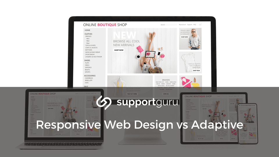
Users access information from an ever-growing range of devices with varying screen sizes and resolutions, ensuring a positive user experience across all platforms is necessary which makes understanding responsive vs adaptive web design important.
This is where responsive web design (RWD) and adaptive web design (AWD) come into play. However, they differ in their technical approach and offer distinct advantages and considerations.
Understanding Responsive vs Adaptive Web Design
Responsive Web Design (RWD)
Responsive web design is a website design approach that uses a single website layout that dynamically adjusts and adapts to fit any screen size, from a large desktop monitor to a tiny smartphone screen.
RWD works in the following way:
Media queries are coding techniques that allow web developers to define specific styles for different screen sizes.
Based on the size of the device accessing the website, the appropriate styles are applied, ensuring the layout adapts accordingly.
Responsive design relies heavily on flexible grid layouts. These layouts use percentages and fluid units (like "fr" or "vw") to define the width and positioning of elements on the page. This allows elements to resize proportionally as the screen size changes.
Images and videos are also optimized for responsiveness, which might involve using different image sizes for various screen resolutions or employing techniques like responsive image containers that scale the image to fit the available space.
Benefits of Responsive Web Design
Since you only have one website codebase to manage, responsive design simplifies website maintenance and updates.
RWD ensures a seamless user experience across all devices, leading to higher engagement and conversion rates.
Search engines like Google favor mobile-friendly websites, and responsive design inherently addresses this need.
Adaptive Web Design (AWD)
Adaptive web design takes a different approach. Instead of a single, fluid layout, AWD uses multiple, pre-designed layouts specifically optimized for different device types and delivers the corresponding layout.
When a user visits the website, the server detects the device type and delivers the corresponding layout.
Here's the breakdown of AWD
Adaptive design relies on server-side scripting to identify the type of device accessing the website. This detection can be based on factors like screen size, operating system, or user agent string.
Web developers create separate layouts for each targeted device category. These layouts are optimized for the specific screen size and user behavior associated with that device.
Since AWD uses static layouts, it might not adapt perfectly to in-between screen sizes or new devices with non-standard resolutions.
Benefits of Adaptive Web Design
AWD offers more granular control over the user experience for each device type.
If a layout is specifically designed for a particular device, it might load faster due to a smaller initial payload.
For websites with very complex layouts that require significant adjustments for mobile, AWD can be a good option.
Choosing Between Responsive and Adaptive Design
The optimal choice between responsive and adaptive design depends on your specific needs and website types.
Consider if your website has a relatively simple layout, responsive design is generally a good choice. For highly complex layouts, AWD might be worth considering.
Responsive design typically requires development effort compared to AWD, which involves creating and maintaining multiple layouts.
Responsive design is more adaptable to new and unforeseen screen sizes.
Many popular CMS platforms, like WordPress, offer built-in responsive design features or themes, making RWD a more accessible option for non-technical users.
Regardless of the chosen method (RWD or AWD), website performance optimization remains crucial.
Ensure your website loads quickly on all devices to avoid user frustration and potential bounce rates. Techniques like image optimization, code minification, and efficient caching can significantly improve website speed.
After implementing your chosen mobile optimization strategy, consider conducting A/B testing to compare different design elements and layouts. This data-driven approach can help you identify what resonates best with your users and continually refine your mobile website for optimal user experience.