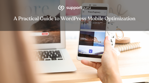
WordPress mobile optimization is a necessity when thinking of bringing your business online.
With more than half of Google searches conducted on mobile devices, it's crucial to ensure that your WordPress site delivers a seamless and engaging user experience across all screen sizes.
Why Mobile-Friendly?
The importance of mobile-friendliness extends far beyond simply catering to the growing mobile user base. It's a strategic decision that impacts your website's overall success.
Here are some compelling reasons to prioritize mobile optimization:
Mobile Traffic Dominance
Over half of Google searches originate from mobile devices. This trend is only expected to continue, making it imperative to optimize your site for the majority of your audience.
Mobile Advertising
Advertisers are increasingly shifting their focus to mobile platforms, recognizing the higher engagement rates and conversion potential among mobile users.
A mobile-friendly site enhances your chances of attracting and retaining valuable advertising revenue.

Mobile Indexing and Ranking
Google's search algorithm now prioritizes mobile-friendly websites, using the mobile version for indexing and ranking purposes.
This means that a poorly optimized mobile site can negatively impact your overall search visibility.
Key Considerations for Mobile-Friendly Sites
When embarking on your mobile optimization journey, it's essential to keep these key considerations in mind:
1. Responsive Design
Responsive design ensures that your website's content and layout adapt seamlessly to different screen sizes, providing an optimal user experience across a wide range of devices.
2. Fast Loading
Mobile users have high expectations for page load times. A slow-loading site can lead to increased bounce rates and lower conversion rates. Optimizing your site's performance is crucial for mobile success.

Steps to Make WordPress Sites Mobile-Friendly
Transforming your WordPress site into a mobile haven requires a strategic approach. Here's a step-by-step guide to get you started:
1. Test on Multiple Devices
Thorough testing is essential to identify and address any potential mobile-friendliness issues.
Utilize Google's mobile-testing tool to assess your site's performance across various devices.
Additionally, check your site's engagement rate in Google Analytics to gain insights into user behavior on mobile devices.
2. Content Consistency
Maintain consistency between your desktop and mobile content.
Ensure that all essential information is readily accessible on both platforms. Consider using accordions, drop-downs, or tabs to organize and present content effectively for mobile users.
3. Responsive Theme
WordPress themes play a pivotal role in mobile optimization.
Choose a responsive theme that dynamically adjusts your site's layout and content for various screen sizes.
Use browser tools to test your theme's responsiveness and ensure a seamless user experience across all devices.
4. Mobile-Friendly Plugins
Carefully select plugins that are optimized for mobile performance.
Avoid plugins that can slow down your site or introduce compatibility issues on mobile devices.
If you're using non-responsive themes, consider responsive plugins that can enhance their mobile compatibility.

5. Avoid Full-Screen Pop-ups
Google penalizes intrusive full-screen pop-ups that hinder the mobile browsing experience. Not to mention, users landing on your website do not want to be bombarded with full-screen pop-ups that prevent them from reaching what they need.
An extra step may be somewhat demotivational and would therefore push potential customers to leaving your site and seeking a competitors.
If you must use pop-ups, ensure they are small, non-intrusive, and provide a clear option to close them easily.
6. Simplify On-Site Graphics
Large images and excessive graphics can significantly slow down mobile page loading.
Optimize your images using WordPress's built-in image optimization tools, or consider using third-party plugins for more advanced optimization.
7. Stay Updated
Regularly update your WordPress core software, themes, and plugins to ensure compatibility with the latest mobile standards and security updates.
88% of smartphone owners use their phones to access the internet. This means that there is a huge potential market for businesses that have a mobile-friendly website.
By making their websites mobile-friendly, small businesses can reach a wider audience, improve their conversion rates, and boost their sales.